
Year
2016
Platform
iOS
My Role
Junior UX/UI Designer
Description
Lifedrops is a digital platform designed to capture and preserve life’s precious moments through video memories. It offers a private, user-friendly space where individuals can create, edit, and store personal video content, functioning like a private TikTok for families and friends.
This project marked the start of my journey as a UX/UI designer and remains a testament to my passion for product design.
My responsibilities
- 1. User Interviews: Conducted interviews with 10 users to gather insights and understand user needs.
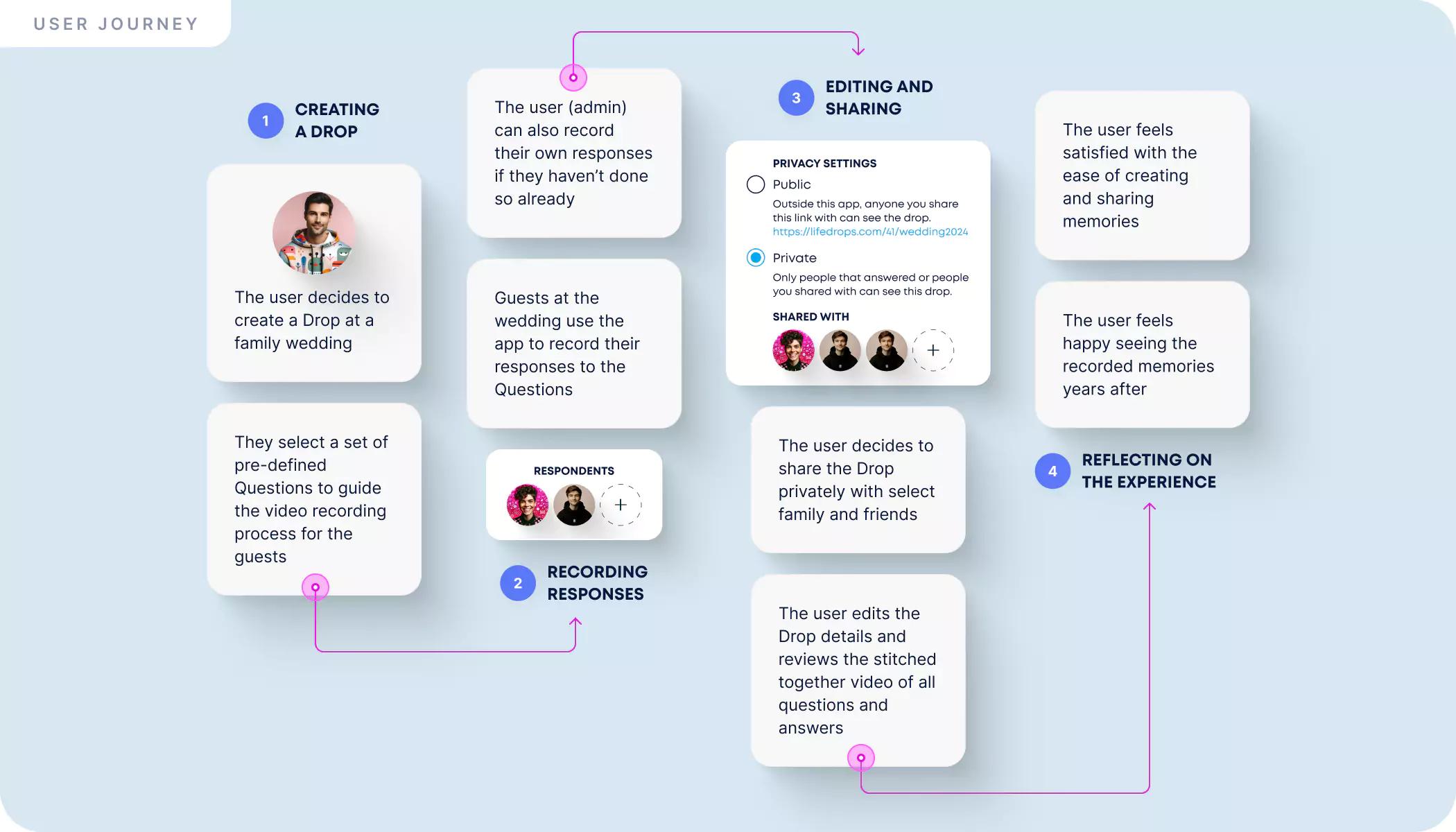
- 2. User Flows: Developed detailed user flows to map out the user journey and optimize the experience.
- 3. Wireframes: Created wireframes to visualize the structure and layout of the product.
- 4. UI Design: Designed the user interface to ensure a visually appealing and user-friendly experience.
- 5. UX Design: Focused on enhancing user satisfaction by improving the usability and accessibility provided in the interaction with the product.
- 6. Branding: Developed the branding strategy to create a cohesive and recognizable identity for the product.
Final Designs
With our primary focus on speed, the MVP includes just a few functionalities: recording, storing, and sharing videos.
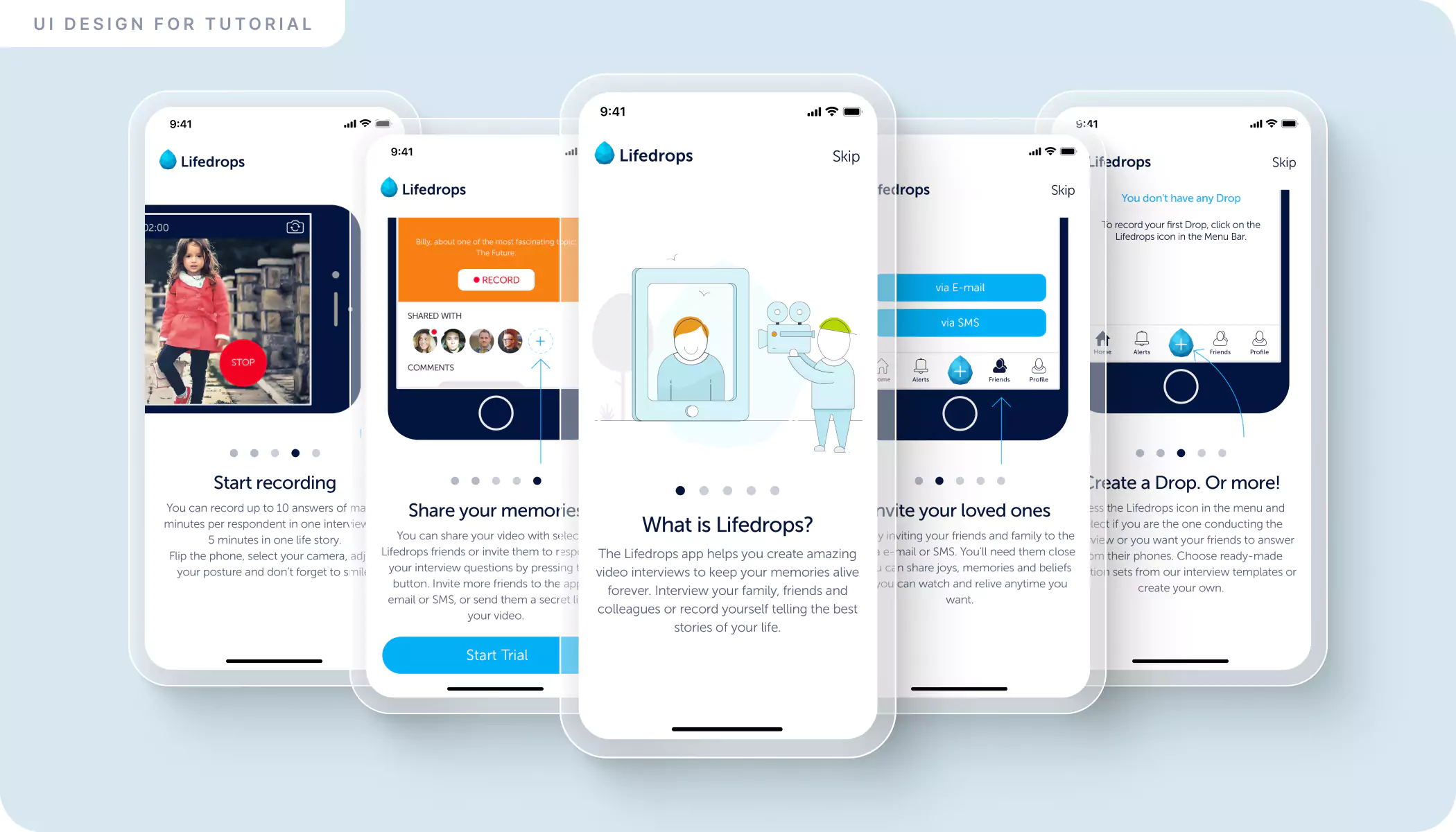
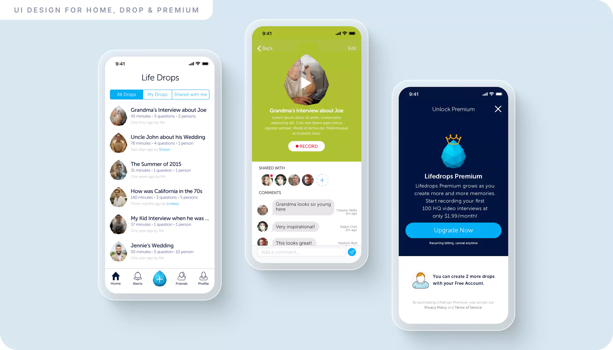
User Interviews
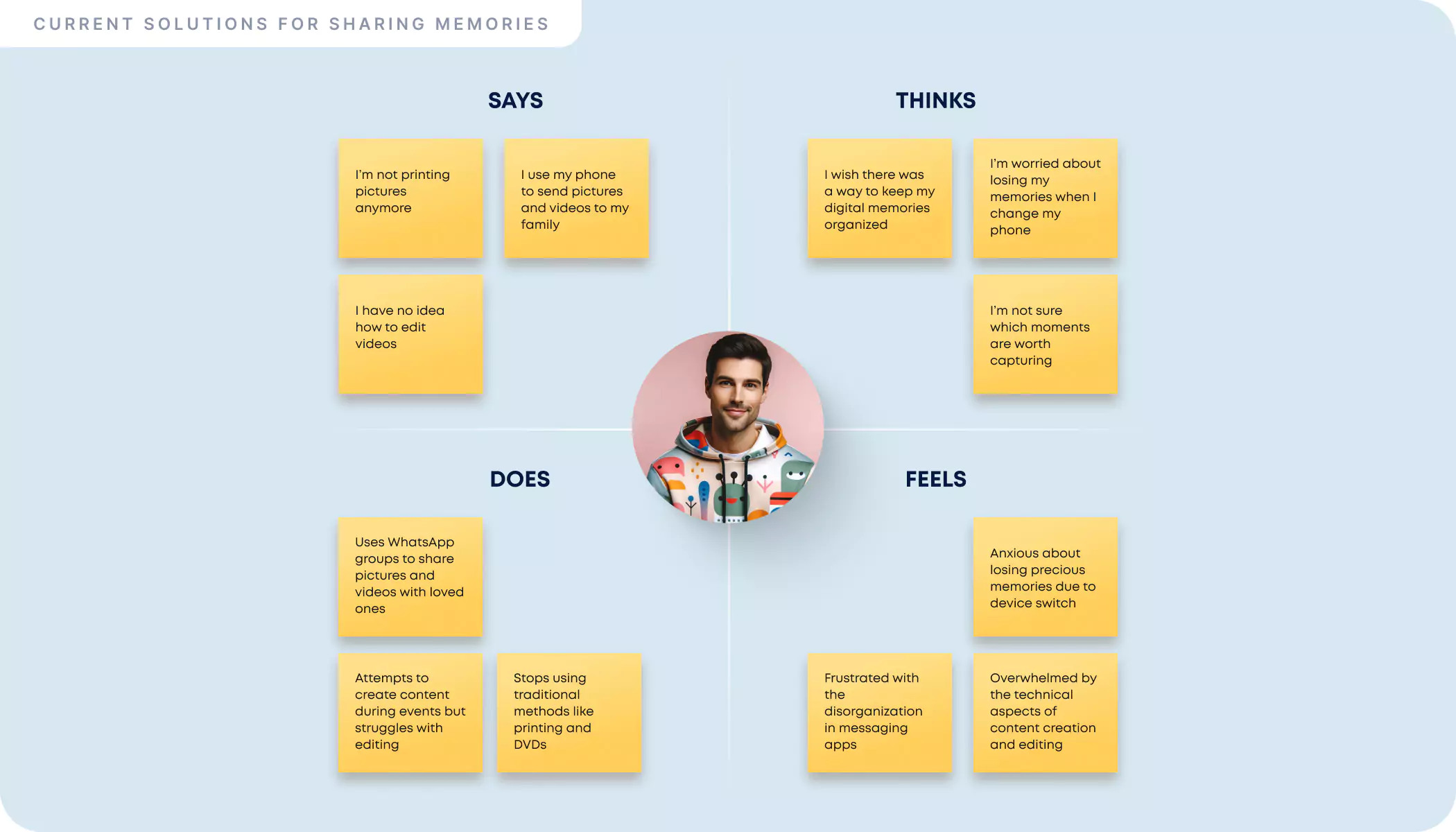
Insights from diverse user interviews have been instrumental in shaping Lifedrops. We understood that even if people replaced physical memories with digital ones, they haven't found a easy way to store and organize them.
Branding
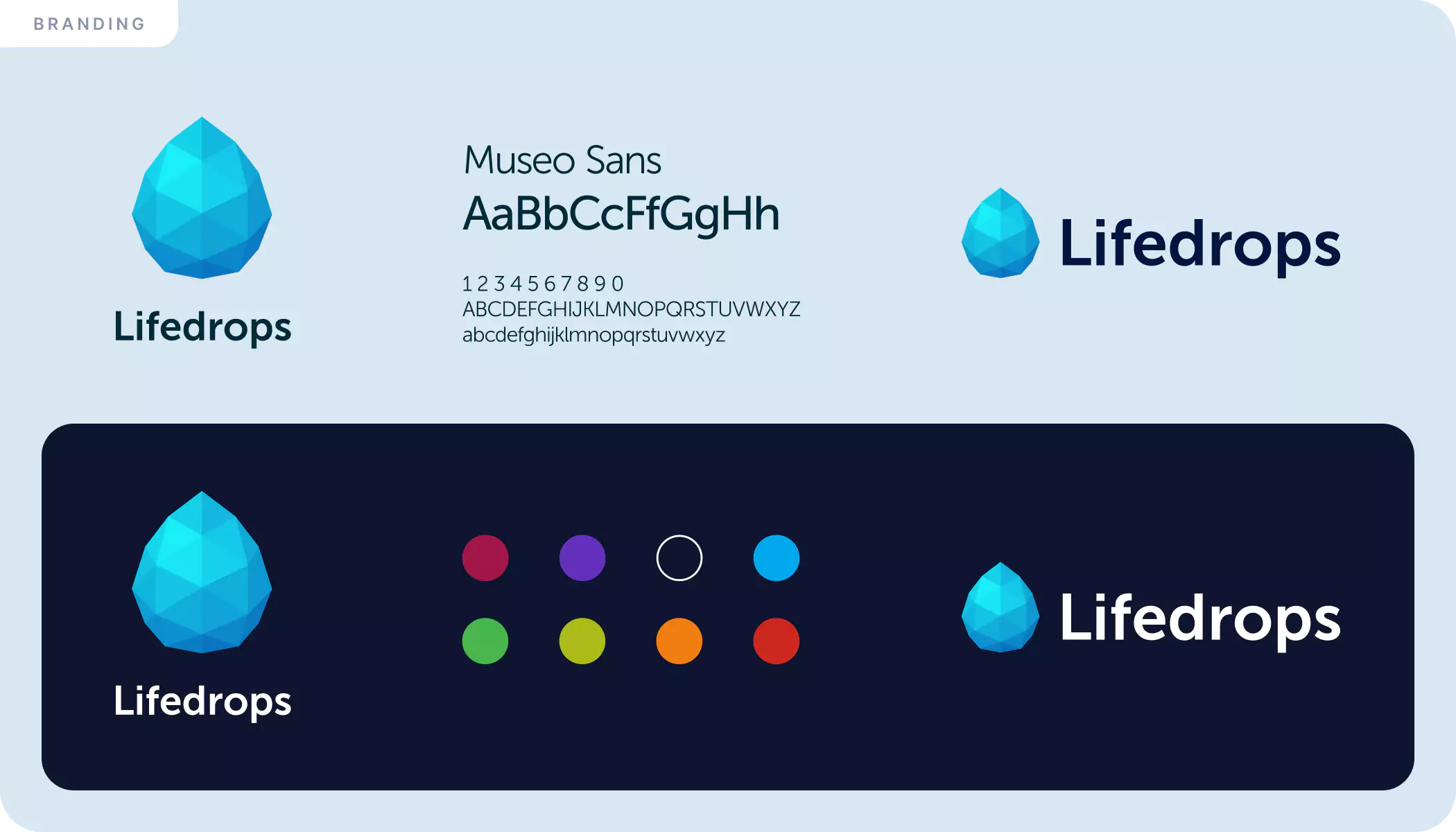
The success of an app also comes from the simplicity of its brand. For the branding, we came up with the idea of a drop that starts empty and over time is filled by one or multiple people with joys, memories, or beliefs.
Wireframes
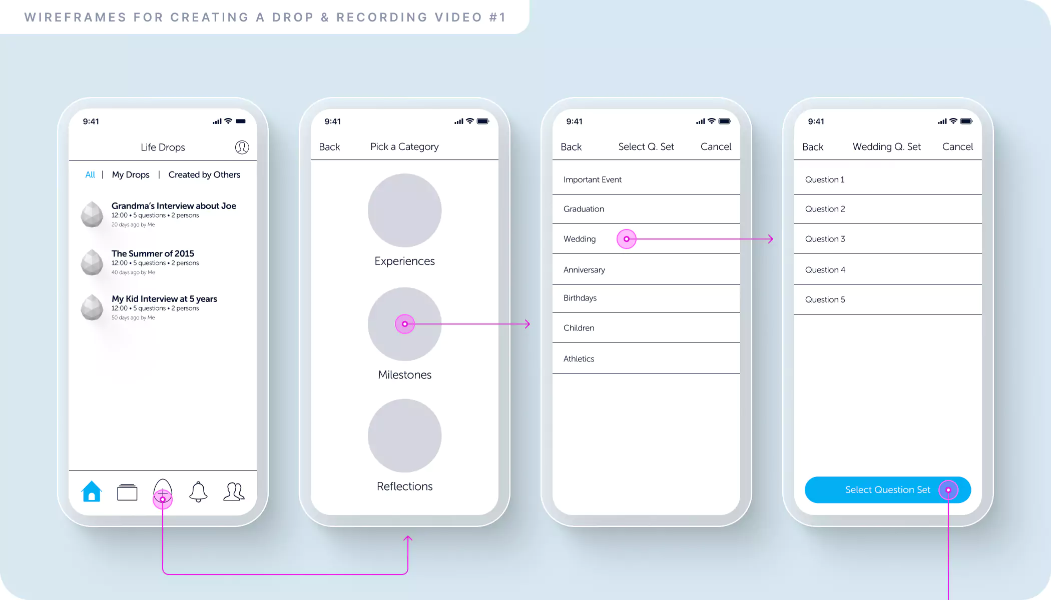
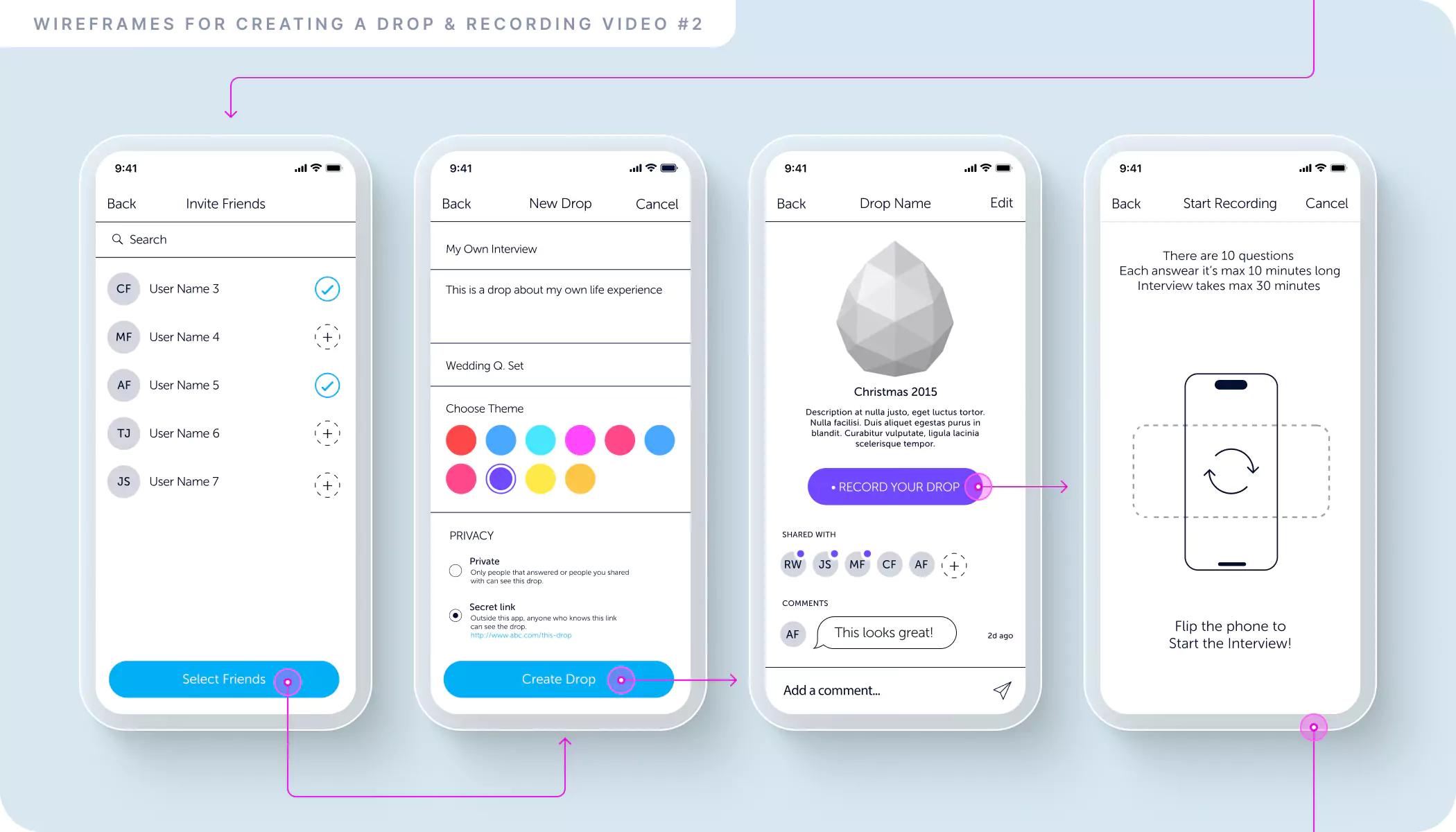
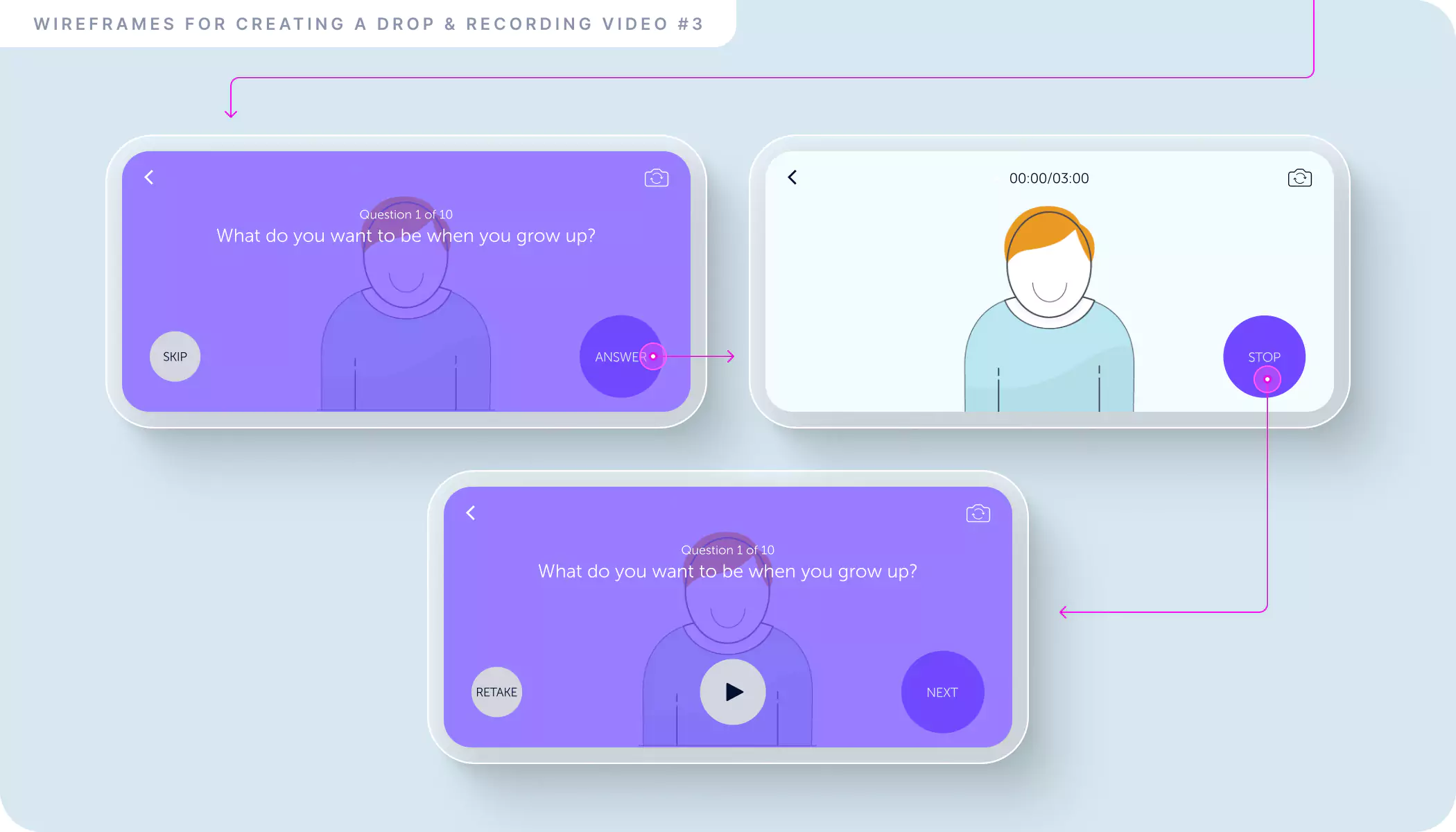
Wireframes served as a blueprint for the product team, mapping out the placement of essential elements like Drops, Question Sets, and the Social feature. We spent a lot in this stage to define exactly how the user will navigate through the app.
Important lessons
Test Design on Real Devices
It is best to check the design on a real phone to see if the font sizes, icons, and colors are suitable for a handheld device.
Focus on End Users
When designing, it is crucial to have the end users of the product in mind. This way, you'll focus on designing larger elements for older individuals.
Smart and Simple Branding
Having smart and simple branding makes it much easier to communicate the project's functionalities.

 Lifedrops